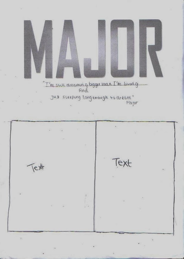
Here are the layouts I have
created for my Front cover, Contents page and double page spread.
This is the front which White,
Black and Red will be used throughout the magazine because they
represent the Hip - Hop genre. I’m going to use a medium close up shot of
the artist would be appropriate seeing as the double page spread is about him.
A quote from the artist is included. I have used typical codes and conventions
for my front cover, the masthead is large and will catch the reader’s eye. Also
the main image is very well-known in the cover; this will attract the reader to
look more into the magazine. The main image will relate to the double spread so
it needs to be eye catching and interesting so people will read it.
Here I have chosen to
use different multiples pictures for my contents page; I think
using multiples pictures is a common thing for Hip Hop
magazines. It focuses more on who the magazine is about than other things. So I
need to make sure I have good images to attract the reader to my
magazine. The word 'contents' is segregated to make it look more
appealing
For my double page spread I have
used a typical layout. The double page spread has one large image of the
artist. A quote is also included to attract the reader’s attention and it’s
different from the usual title used in articles am also going to base the main
article around a biography with a current Hip Hop artist. I think this
will allow me to create the main article quite easily. I am happy with my
layouts and I think I will be able to create my magazine fairly easily.


No comments:
Post a Comment