Sunday, 29 December 2013

Production Schedule


Now I'm here in the process of project and the way of finishing my magazine.  I have stuck to this scheduled plan as it has helped to me keep on track with things and make me complete the project on time and not get behind. I am really happy and glad that I made a plan because I have seen a difference in this task compared to the preliminary task. I have been more on time and been able to manage my time more effectively doing tasks together to save time or being able to spend more time on certain things. 
Here is my completed plan. 


Date
Task
Completed/Notes
18/10/13- 26/11
To have completed all my planning and research for my music magazine. I need to analyse a front cover, contents page and double page spread. Researched my different music genre magazine. Decide crucial decisions, names, colour scheme and masthead and also created questionnaires and evaluate them.
I completed all the tasks. I found it easier with a plan because I knew when to start and finish certain tasks.
20/12/13
Edited my original photos and evaluate it
Uncompleted. Must be completed so teacher can review.
10/12/13
I need to conduct my photo shoot before Christmas holidays so I can start to create my front cover.
I carry out my shoot taking around 100 pictures. They are the best and quality pictures.
6/01/14- 13/01/14
Mock exams
Revise for media exams
24/01/14- 31/01/14
Working on original front cover magazine
Completed
4/02/14- 11/02/14`
Complete on original contents page

14/02/14-21/02/14
Complete on original double page spread

01/03/14
This is the deadline for the coursework. So I need to complete all my pages  and evaluation questions.
Having a plan has made things a lot easier, I have been able to manage my time and get things done on time

Friday, 20 December 2013

Double Page Spread Article


Looking at all double page spread throughout the process of my project, I noticed that the paragraphs were usually very short and sentences were not long. I also found that the language and style of the article link to the target audience connotes more personal and direct. Therefore, when creating my article, I made sure I kept to these conventions in order to make my article realistic and to make sure I met the needs of the target audience


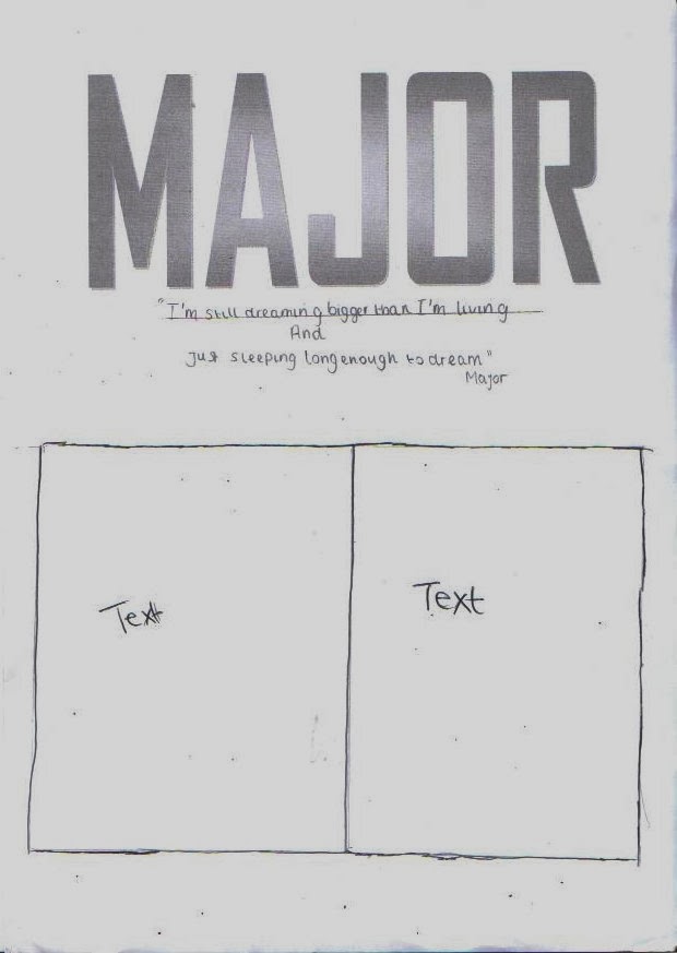
Title of article: Major

The quote in the middle of the page: “I’m still dreaming bigger than I’m living & just sleeping long enough to dream”. Major

A few days later, sinking into every studio he could find areas of the United Kingdom, Major talks about aspirations and rap, what he hopes people will be saying about him and hip-hop years from now. ‘Rap is movement, a collection of like minded people who got fed up of the way rap music was heading, so decided to go out and change it themselves rather than sit around and complain’. He says. “I think people going to look back and remember that guy who made history for rap’ he says”.

It’s just after 8p.m in the celebrity state of mind. The 20 year old rapper is surrounded by flat screens TVs and thousands of pounds in recording equipment. Outside, urban beauty landscapes sitting on a bench, while jammed freeways of underground and tubes. Some 1,000 miles in the northern, though, where Major is from, the picture is a bit remote. Tottenham is suffering like no other major area in this country. Though British Prime Minister David Cameron bailout the society of the young youths and futures  there’s breathed  a  bit of new life into its downtrodden metropolitan  , there’s weakening promise in and around Tottenham these days. Homes are abandoned, jobs are insufficient, and crime is high. But it does have rap.

Major – the native son signed to Jay-Z’s Roc Nation / Def Jam imprint has landed five songs in the top five of Billboard’s Rap/ Hip- Hop charts in the year and change since his debut album, Finally Famous, hit stores. As he gears up for the release of his EP, Major due in early 2014, Major knows his success shines like an inspiration in dark days.  As the first rapper from United Kingdom especially from Tottenham on this scale since 2pac did more than a decade ago, he proudly bears the burden of hope.

“It’s deeper that just coming up or making money”. Major says “we got the potential and opportunities to change the world and still have fun with it’ its responsibility that I feel like I’m willing to take”.

Major had a very successful years, attributed to the fact that “each project I was just talking about what I wanted to talk about and people loved it , but the fact I put out three mixtapes after four years let them see a lot of me, and the consistency of the work been  paid off in a big way”

 Over the years, many rap fans doubted that Michael Brown would ever be such in a position. Back then, it looked  more likely that he’d be remembered as “that guy Jay- Z  signed who never came out” but then after four years of waiting, three mix tapes and a moderate 100,000 units sold in its first week out , Finally Famous proved to have longer period than most of the competition. The hits kept coming.” Living the good life” feat Jay- Z, “London Boy” Remix with UK all stars rappers; “Never forget me” with  Jhene. Aiko.
So what is next for the young MC? An album, apparently. "MAJOR EP  ! I'm so excited for it, the mixtapes were cool, but this album will be just bigger and better in every sense. I can't wait" However, he is keeping his cards close to his chest when it comes to
revealing any more details, "I can say there will be big producers, and big features, but I don't want to ruin the surprise, you'll see," as the words fall from his mouth, mischievous smile is casted on his face; signalling that 2014 was just the beginning, and this year, no one is safe from MAJOR … No one.

Friday, 22 November 2013

Shot Plans

Here I drawn out my position shoots for magazine for each models. I have also added descriptions and additional notes  to each sketch to explain what will be happening in each shot.

Draft Front Cover, Contents and Double Page Spread

I have decided to create a draft version of my front cover. This has given me an idea of what my final front cover will look like but only an idea. I have used the three dominant colours: red and black. I also have added in white because I think it definitely needed another colour to make it slightly brighter. I think the overall look of the draft is fine; I have made it just to give me an idea of how to make my magazine. The background is very plain and I think I want to add in a texture to add another layer to my front cover. I think the cover lines I have used are suitable for the genre of my magazine as they focus on the music side and fashion side of Hip Hop culture. I have got some audience feedback which will help me when I create my final magazine. The feedback I have received is from the demographic of my magazine, 16-19 years of age. 


Here are the layouts I have created for my Front cover, Contents page and double page spread.


 This is the front which White, Black and Red will be used throughout the magazine because they represent the Hip - Hop genre. I’m going to use a medium close up shot of the artist would be appropriate seeing as the double page spread is about him. A quote from the artist is included. I have used typical codes and conventions for my front cover, the masthead is large and will catch the reader’s eye. Also the main image is very well-known in the cover; this will attract the reader to look more into the magazine. The main image will relate to the double spread so it needs to be eye catching and interesting so people will read it.


Here I have chosen to use different multiples pictures for my contents page; I think using multiples pictures is a common thing for Hip Hop magazines. It focuses more on who the magazine is about than other things. So I need to make sure I have good images to attract the reader to my magazine. The word 'contents' is segregated to make it look more appealing


For my double page spread I have used a typical layout. The double page spread has one large image of the artist. A quote is also included to attract the reader’s attention and it’s different from the usual title used in articles am also going to base the main article around a biography with a current Hip Hop artist. I think this will allow me to create the main article quite easily. I am happy with my layouts and I think I will be able to create my magazine fairly easily.


Thursday, 21 November 2013

Models for the Magazine

For the models of my Hip Hop  music magazine I have decided to use some of my friends.All of them have  very fashionable and a particular look about them that I think is suitable for my magazine. I am looking forward to working with them as I think they really understands the concept of my magazine and I think this will really help. I also think using a male for my front magazine will help because I do not have to do make-up and hair is not necessarily hard to do. The clothing he wears just normally is very urban so I don't think ill have much trouble with clothing. 

Friday, 15 November 2013

Costume/Props Planning


Here I will be showing what kind of costume my artist will be wearing. Here I want to explore my artist’s costume more of modern generation of hip hop such as Kendrick Lamar, Chris Brown, Big Sean and other artists in magazine such as XXL and the source.


So I decided to use Jewellery to displays wealth but can also be used to show superiority. However mostly all rappers is that in some form or another they will be wearing jewellery. It fits into the gangster stereotype portrayed by rappers perfectly.  Also jewellery is a trend seems to revolve around jewellery attracting women and which is something rappers are supposed to get a lot of.

However hat are some form and is suitable to wear. i think the uses of crown,my artist will wear a hat is always suitable to wear. Here my artist will wear a crown on his head as a a sign of power,richness and authority.The uses of crown suits the most as when it's worn a shadow is cast over the persons eye line creating a sense of doubt and unease which could support the understanding of a hustler or thug.

 Unlike a coat which displays wealth, causal top displays physique and could portray a raw, appealing image with the right body. On the front cover of Hip-hop magazines, many artists are shown of artist cover their showing respect, authority and class. Not only does it creates quite a vain image but also adds to the stereotype of a rapper being power and 'hard' (as in rough and strong).


Locations, Set Design & Lighting

Mise-en-scene is a very powerful element of Television production & Entertainment. It is important that we understand the knowledge behind the featured areas & locations in a music magazine.In the music industry such locations are highly reflective of the featured genre and are often stereotyped. Hip-hop/Rap Artists are often associated with things like, dark locations, vehicles with chrome rims and studios. The mise-en-scene in a media product usually personifies the artist and gives the audience an idea of what type of person that artist is. its important to display wealth in the Hip - Hop industry 


Here is a photo of one of Eminem. Em is known for his dark musical persona and by judging from the image we can clearly see that because it simply reflects who he is and how he actions. The way the darkness almost covers him and the only thing illuminated is him which gives a pretty powerful effect. I really like this and this is something i might just consider trying in a future photoshoot.  


Conclusion

With all of that said i have clearly  note that Hip-hop/Rap artists associate themselves with the latest fashion & jewellery on the market and that it is essential for them to look their best. The set scene plays an important role in the production aspect of any media product as mise-en-scene can have a great impact on the target audience and it is crucial to understand the importance of any media product's appearance because each one has an understanding ad story  behind it, sending a unique message. Now that I have a more  understanding and knowledge of the props/ costume  associated to the genre as well as set the scene ,I now have the confidence to dress my model and design my scene in a way which reflects the music genre's style that I will be featuring. 


Reader Profile

READER PROFILE


Kendrick, 21, lives through passionate and inspiration of Hip-hop.  As lad he kind of guy who likes to relax at home, listening to music through his iPod rather out with his friends at nightclubs or house parties. A fan of both old school and new school. Kendrick’s favourite artists are Drake, Jay Z, Method man, Dr Dre, N.W.A, The Notorious B.I.G., 2Pac, Wu-Tang & Nas. Above all what Kendrick does, he always fanatical about their music. He engages with music 24/7 when he is not listening to music or watching music he rather talking to his friends about music. He’s day-to-day activities include music in one from or another. Getting ready for his part time job as music teacher in a boys school showing her explores and ambitions in music to them. Whilst travelling to work, he has his headphones in.


Kendrick uses his income wisely and he is a fashion trendsetter in his peer group but musical icons heavily influence him. The way he looks and the clothes he wears are integral to communicating ‘his identity’ to the world and his musical knowledge. Kendrick dresses with pride and on a casual day can be seen in a logo jumper, jeans and a pair of Jordan’s trainers. As well as for entertainment, Kendrick considers Hip-hop to be an important aspect of his life with his single mother and his little brother, finishing university course in Music, One day Kendrick hopes to fully his future aspirations and dreams involved with the music industry.


Designing the title block


To start my music magazine off, I have to first think of the masthead as it is the first thing that catches the eye or that the audience looks out for. I wanted the title to fit the genre and style of the magazine that it is. After this I came up with the name ‘RAW’, I chose this because I thought it was best suited to the genre I was going for this magazine. To me Raw connotes in with the hip hop society how it’s more powerfully impressive and also show hip hop is not dead that music now 0 raw. Then I had to find which font best illustrates the magazine and the title. Out of all of the fonts I tried I went with the font American Captain, I’m going to have it coloured in white on a red background linking  to colour scheme that I find out on my questionnaire results. As you can see red , is a prominent colour in these magazines as it catches your eye. I think using red in my magazine will draw people to certain parts of my magazine. The Black and White will be the base colours, like for coverlines to emphasises different points . and the red will act as the colour to draw attention. 

However the other fonts such as Font 2  was more for headlines/subtitles, although font 3 captures the genre of the magazine I felt that it was to unconventional for the magazine and font 4 made it a bit of rock genre magazine so wouldn't be appealing to the reader.

The font is smooth and fun however the thick bold letters convey masculinity and will fit perfectly with the Hip-hop theme. The font also suggests a youthful audience.I am happy with the colours as I think they will work well together and help me create a successful R&B and Hip- Hop magazine.


Font 3 : Dolce Vita Light
Font 4: Oloron

Music Magazine Title Blocks Analysis

Production Log

I have been working on a name for my magazine. The name of the magazine is one most important elements of the magazine and it needs to be something that will stick in a reader’s head. If the reader is unable to remember the name of the magazine then it is hard to remember and complicated. In order to this, I analysed and look at other names of other magazines. From this, I added branch which described the genre, style, artists, what it would include etc. So whilst doing my questionnaire, I got feedback on names for the magazine   and most people agreed on RAW and it was an effective name as it’s not just a random word but in fact has meaning to it. I think this will be a good magazine as its short, snappy and would be easy to remember as it’s a word that links to music and tends After deciding on the magazine name, I then had to consider the design and colour of it. I looked at the website ‘dafont’ in which you can actually download any font that is on the website and use it.


Friday, 8 November 2013

Audience Research

Audience Research Survey


Here's a presentation where I created a questionnaire on Survey Monkey and printed out copies of website address and send to messages to a number of people for them to complete. This presentation includes graph charts to display the data collected and also an analysis about what the information I gathered. The information has been useful and has given me some good ideas  regarding the create my magazine.

Friday, 18 October 2013

Initial Ideas

This is my Initial ideas page that portrays my ideas for my own magazine. It shows how I will design it and what I will/may include.Also why i choose Hip Hop genre.

Plan For Magazine

After finishing my preliminary task, For me to make a magazine I have decided to make a plan to help me manage my time. here I have created dates on when I need to start and finish certain tasks. I believe this is going to help me a lot because in the preliminary task I did sometimes not spend enough time or too much time on some things which then made me behind. So having a plan will hopefully make me on time to hand in my project. I have created a completed box that I will fill in after each task. I am going to keep checking my plan behind my book to ensure I am on time for everything. 

Introduction of the Main Task

In the main task I did an analysis on the front cover and a double spread cover. Then we have to do a questionnaire to find out what type of music magazine will attract your audience and then put the results into graphs. Then I have to take a picture to put on our front cover page to reflect the genre of the magazine. Also we have to create along side the front cover but also a contents page and a double-page spread. I have to sketch of the music magazine.

Different music magazine genres


Friday, 11 October 2013

School Magazine Evaluation

11th October 2013.

We continued to finish our school magazine and also set up our blog for Mr Jad (coursework). My blogs were made on www.blogger.com which allows us to post documents, texts, pictures, videos, prezi and etc.; which will make it much easier when using different types of multimedia for our independent research. Also, it will keep all of my work much more organised as I can add labels to show different type of posts pages to separate it even further. At the end of the unit, I will have loads of different posts explaining what I’ve done in every lesson, various pictures, research and all of my coursework. Blogger helps as it will keep all of my work together and organised and also very efficient.  After setting up my blog, I continued working on my magazine and managed to get the front cover finished since its only one lesson, I didn’t have time to do much else; I will come in during my free periods and spare time to complete my contents page as well.

As it’s for the school, I had to think about what colour attract, not only both sexes, but for a wide age range from 11- 18 years old. Blues and yellows (FCH school colour) seemed appropriate and not to childish, so it appeals to all. I’ll also use as many photos as I can from what I took to ensure every page is entertaining and good to look at.

Final Magazine and Content Page


Tuesday, 8 October 2013

Production Log

8th October 2013, we had our first AS media studies lesson in which i began making a magazine for the school. Every photo I took, I decided to picture if the school environment and society in of the school. I went around the school taking photos of different people and surroundings in different places.

After taking the photos, we returned back to our room and uploaded them to the computers and then opened an A4 sized Photoshop document and began create my magazine. Out of the photos taken, I chose a mid-shot one for my front cover as it is fairly close allowing the reader to feel a connection immediately.  The photo was of my friend Ellis posing outside the school surroundings. After adding in the photo, I had to choose a suitable magazine name, so I chose ‘ FCHS’. Similarly to above, I then plan to add in the FCHS next to it so it’s recognisable to the students, hopefully increasing their choice of buying the magazine. Obviously the image on the front cover, portrays the main storyline, so the text ‘’ is in big font to attract readers and stands out from all of the other storylines surrounding it such as and etc.

I will continue to finish the front cover and create a contents page next lesson using more of the images taken.


SCHOOL MAGAZINE PHOTOGRAPHY


Friday, 4 October 2013

Draft of Magazine

DRAFT OF MAGAZINE


This is a draft of my school magazine in which I created a front cover and contents page of a magazine for my school. I have based my magazine on everyone who likes to read magazine and read. I used a medium close up shot of the students showing as it appropriate image to for a school magazine. My main focus is the women who are positioned in the centered of the page and her facial expression connotes happiness and her body language suggests how she is relaxed and enjoys her school. The font I used for the title is simple and stands out.  I used the quote “plus!” convince the reader to explore the magazine in more depth.  The student is dressed in a casual and smart way to connote the feel of the school, a relaxed environment where students can learn.


The contents page has a large image of students walking and enjoys the school environment and community. The word 'contents' is segregated to make it look more appealing. The pictures on the left hand side relate to an article for each page on the magazines, the numbers are showing which pages it on.


Textual analysis of school magazine


Tuesday, 1 October 2013

My Blog

This blog has been created to follow the progress of an A Level Media Studies advanced portfolio project. The blog will be following me on the planning and the creation of a music magazine where I will be planning and creating a music magazine front cover, content page and also double spread page. Enjoy!